
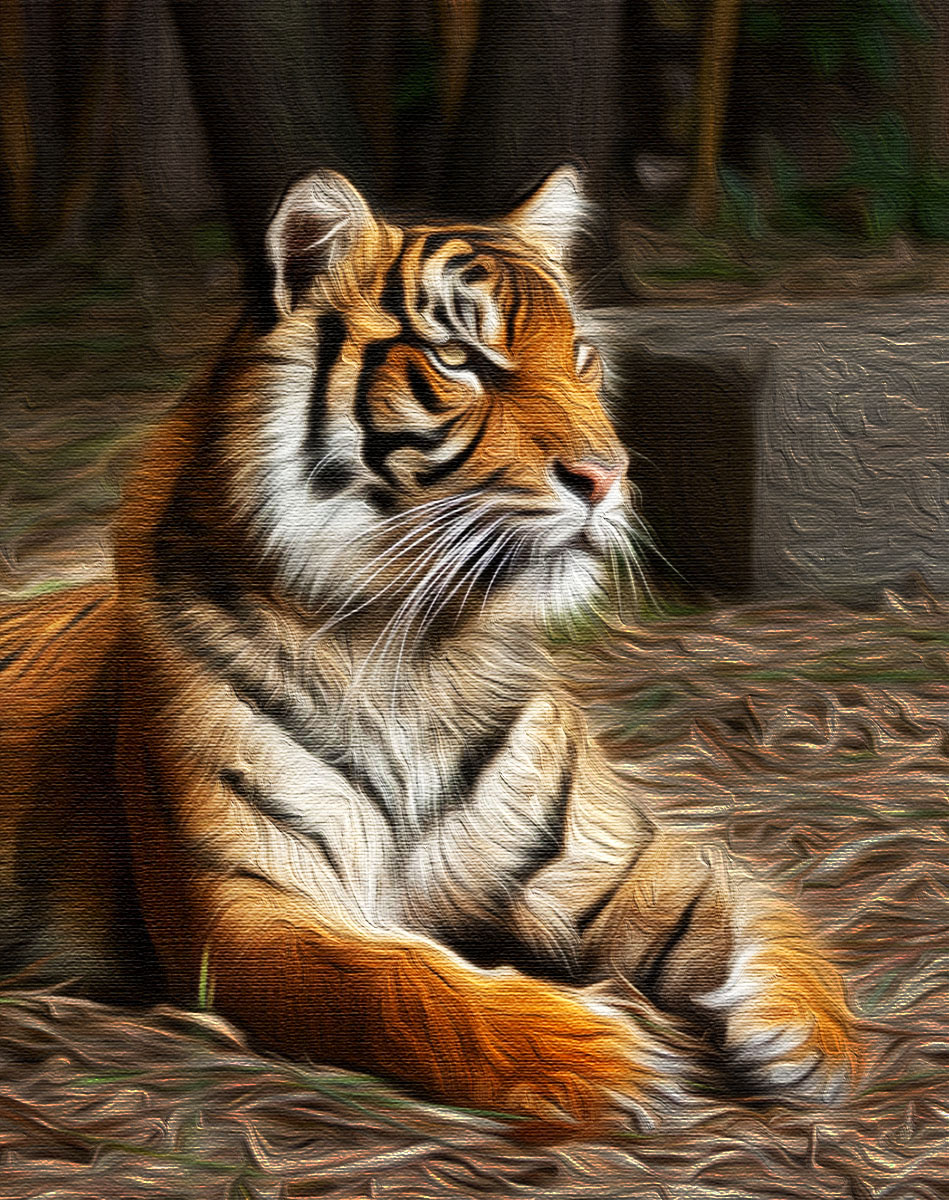
New and improved hopefully – click to embiggen
So I got some EXCELLENT feedback from my first post and so I sat down to tackle the image again with that in mind.
Unfortunately I had only saved a jpg image so couldn’t remove the canvas texture so it stayed.
I added in a brightness/ contrast layer, and increased both and then masked the background back to the duller background layer
Then I duplicated the layer, bought brightness and contrast down to dull the background even more and masked in the bright tiger
Added a vibrance layer and just gave the orange tonings of the tiger a bit more oomph!
I’m much happier with this version, it doesn’t have that flat horrible look that the first one did (or much less so I think)
The tiger really pops from the background and has regained his presence and energy and a bit of eye brightness.
Could have gone a step further to try and blur the background but my selection skills suck and with all the fur and whiskers it was complicated, so this is where I decided to stop.
THANKYOU to everyone who said they didn’t like it and why, love to hear what you think of this version, if there is an improvement, ya’ll responsible for that 🙂


Ah, MUCH better! He pops out of the background more — has more life to him — and seems less like the disappearing Cheshire cat! 😉 Still — I’d say both versions are a hit. You learned about the limitations of the technique and got some great feedback. And that’s awesome stuff 😀
All the best to you —
Thanks Jen, yes I count it for the win as well 🙂
😀
After finally getting behind a real PC I can have a look at your slide show and compare properly (It is not working on the WP app as it needs Java script to run). I like this version much better as well! I was looking at your other picture yesterday evening on my phone and didn’t realize what happened to his eyes. The poor guy lost his pupil and unfortunately it is still gone in the new version… But I also have to say that it is only very small in the original due to reflections in the eye. Otherwise I think you did a good job with improving the picture!
Thanks Sari, yes I could see the eye was improved but it was so small I wasn’t sure how much better I could make it. I was thinking about copying it from the photo and pasting in but my ability to select things with accuracy in PS is pretty limited at the moment, so I chose to just not go there and risk ruining it further LOL
That was well worth the extra effort, Stacey. The tiger stands out much more against the background. The colours look really rich, but still natural. Nicely done!
Thanks Chris, Im glad I had another go at it, I used tools this time round that I hadn’t used before, was a good learning experience 🙂
good job of it! Looks quite like a painting on a canvas!
Thanks that was the effect I was aiming for ultimately 😊
Big improvement, I always say the touch of darkness improves images.
Thanks Lore, I have to agree with you here 🙂
Oh, yes! Version 2 is definitely a winner!
Thanks Lois, Im glad I had a second go, much happier with it now
I do like version 2 more than 1 because making it a bit darker around the tiger does put more focus on the tiger. I’ve been working on techniques on how to create photos with multiple elements and how to make one element really stand out. I’ve found that by lighting and darkening certain areas on the photo really help achieve this.
Thanks Justin, sounds like a technique I need to understand better myself. While this is an improvement there are still areas like the big grey block that intrude.
In this version the tiger really stands out. Great response to all the feedback.
Thankyou, I had to do something LOL
I like this a lot. The oilpaint processing suits the image well. Your second version is much better. With the background darkened the image really pops. I can’t add more to what others say. It’s good. Looking forward to more.
Thanks Joanne, its certainly better and I had a great learning experience. PS is still so new to me I often don’t know what I *can* do with it 🙂
Version two is a big improvement for the earlier post. The picture pops more and the effect feels less generic.If you did remove the canvas ( although it is stuck on the jpeg) I wouldn’t object.
If I could I would have removed the canvas this time round but didn’t want to lose the curvy texture I had managed to work first time around. Maybe the canvas works better on landscape style images, will have to do one to find out 🙂 Thanks for the feedback Ben!
I really like this editing today. The tiger really pops out from the background and is the main focus. A much stronger image.
Thanks Raewyn, I like “stronger” as a description 🙂
Yes, I would have to agree with everybody else and say that the second image is much better, I like the oil paint effect, but the subject and background did seem to blur together quite a bit and you have skilfully managed to correct that. A great job, I’m looking forward to next week’s edit. An amazing portrait by the way, surely its not easy to take pictures of the big cats at the zoo!
Thanks Katie, actually these cats were pretty easy, they seemed really tame and the handlers were making a point of bringing them up to the viewing area so they could be seen. Was just lucky this lovely boy sat down for a bit of a breather really close and allowed me to snap several image – I have a couple of him washing his paws and the tongue is HUGE 🙂
Looks like a huge step forward Stacey – presently viewing on the iPad, so will check back later on PC 😃
Thanks Robyn, yes had to have another go to see what could be done!
Pingback: One Four Challenge: February Week One | decocraftsdigicrafts
That’s an impressive change in the lighting.
Thanks Lynne, it demanded “more” so I twiddled til it felt better 🙂
You have been busy! What a wild subject, and you are right about his paws being so interesting in how relaxed they are. This second version does suit the image much better, the darkening, in just the right places brings out the tiger and all his find features. My eye does still jump to the grey box behind him, not as much in the second version. Is there a way to smooth out the texture just on the box? I am not sure of a solution for you, just where my eye goes.
Really looking forward to seeing this image each week, it is a beauty.
Ah the dreaded grey concrete cube! I wondered if someone would comment 🙂 My PS skills are still very new and limited and I wasn’t sure of the best way to deal to it and didnt want to ruin what I had done so left it, it did get toned down a bit but the texture on the bright side is noticeable.
I have some wider angle shots I might be able to harvest some foreground from and see if I can match up the tonings to remove it, thats way more complicated than I have tried to do before tho!
Sorry to be the first to bring it up…I think it is better just even in the 2nd version, shadows part of it which is great. I am sure your further versions over this month will continue to favor your image. You always impress me with where you take your images. Cube aside, that is a handsome cat, fun to see so much detail.
No you were completely right mentioning it, I totally knew it was there but with everything else I had done, it was just a step too far 🙂 Didn’t want to push my luck.
Its interesting to note who does comment on what tho, as everyone sees images in different ways.
Yes, the heightened contrast does wonders, and gosh that oil paint effect is very appealing… really suits the subject. His majesty having his portrait done. 🙂
Sitting for his portrait, I like that idea 😊
OH! Wow! This is much better! Yes, this is what I was trying to suggest… Great job! 😀