
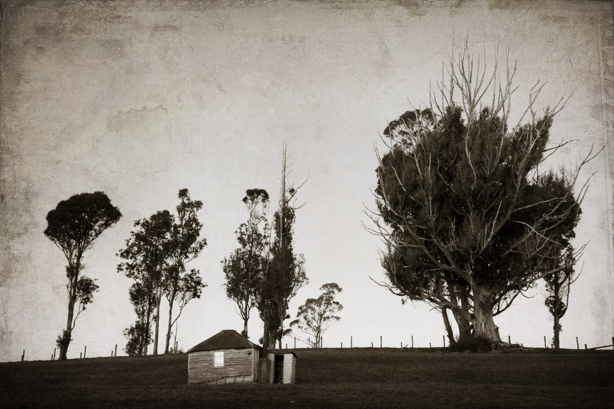
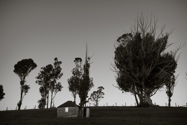
Click to embiggen
This was taken at dusk, the last spot of light reflecting off the window of the hut. I liked the stark lines of the trees against the sky and hoped I might make an image of it.
First I processed it as a BW in Lightroom which was alright but nothing special. It was a little dark and lacked contrast.
 So I took it into PS and had a play with adding some textures. I was liking the slight sepia tone and wanted to add more of an aged forgotten print feel to it so added some overlays that darkened up the edges and put some water marks on it.
I really liked how with a bit of playing you can take an OK image and make it into something more artistic with some careful additions of texture and blend modes.
What do you think – does the BW stand alone? Is the textured one better?
Which one works for you?


In the textured photo, I cannot take my eyes off that beautiful sky. But in the B&W photo, I am mesmerized by the starkness of the entire photo. A toss-up for me, Stacey. No help, right?! 🙂
Oh there is no wrong answer, if anyone likes ANY of my images I am happy:) I am pleased you commented about the sky in the textured one as I put quite a lot of work into that and was happy how it turned out 🙂
I love the textured look and totally agree with your comment. You can take a meh photo and turn it into something special. I can spend hours working on my images with textures etc. That is what I really love about photography. I am not saying your original image is meh, it is great to start off with.
Next week I am teaching basic Photoshop skills at the Heretaunga Women’s Centre. I want to show women how to play around with it and hopefully improve their photo skills
Good for you, I am teaching two workshops on Sunday too, intro to BW with Nik and Intro to Layers, blending and masks in PS for my local camera club
I agree with Lois. I love the starkness in the original image – sometimes an empty sky can be very profound in a shot. But the textures photo really is very cool.
I agree about sky, I am not sure why but I felt it a bit overwhelming in this image – maybe cos the trees are so big and the hut was so small?
thats why some texture helped balance it out better in my opinion
Yes! That’s it – the hut looked so tiny. Definitely nicely balanced with the textures.
The hut is tiny, barely 6ft square!
Wow, do you know what it was used for?
I think someone lived in it, has a chimney. On a farm so maybe only sometimes? But I saw similar tiny places in Tasmania that were lived in
Wow I can’t imagine!
There’s more “pop” in the textured one. The b&w looks a bit flat. And of course the texture adds more interest in the photo.
Thanks, I agree 🙂
I prefer the textured one for everything except the hut, there I think the window looks more natural in B&W, it seems to me to be more glary with the texture.
It is quite glary and the textured version is a lot brighter so that makes sense – I liked it because it brings the eye straight to the hut first and then you can move around the image from there
Fair enough 🙂